
Table of Contents
👋 Hey there,
After a few weeks of work, I’m finally able to share and publish the latest changes to my website.
This project is one of my favorites because I can freely explore, play around and experiment, and there’s also room for improvement always, so I like to look for alternatives and new technologies to try and make it better.
Therefore, here’s the result of the most recent update for my website, and I’d like to highlight some of the biggest changes.
There was an attempt
This time, I wanted to build my website from the ground up using Astro. It seemed really interesting given its mostly static output, fast loading sites and more.
I really tried. I did for a while, moving component by component from Next.js to Astro, even converting some React components to Astro components.
Anyway, every time I did some progress and wanted to achieve something else, I found out that it required some extra configuration to be done with Astro. At the end, it made more sense for me to keep using Next.js as it was much easier and faster to accomplish and keep many of the things and features my website already had and that I didn’t want to lose.
I will try to expand on my experience using Astro for my website in a future blog post.
By the way, I’m not saying Astro is bad. It is just different and many things are done differently when using it. I wanted to have this website update ready quickly and didn’t really want to deal with lots of configuration to have the same I already did.
The good thing is it helped me configure a few things from scratch, like tailwind and styles, allowing me to have a cleaner setup and less complex styling code.
Design & Colors
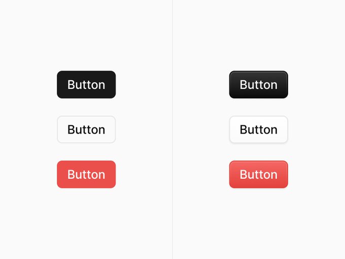
Some of the components have been given a new look. Inspired by some of the latest design trends (found on Twitter), I have decided to give buttons a new look.
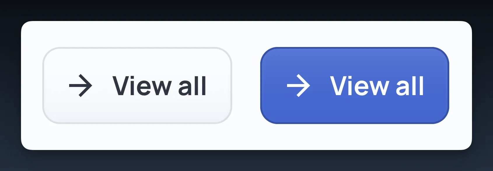
I also made them a bit bigger to increase its touch target region improving its accessibility. This change also applied to social links which were really small before.
This change is inspired by this tweet:
There are only 2 types of designers these days. Which type are you? 👀
Home page
The home page of my website now includes a top blog posts section. I wanted to highlight the most popular posts in my website and also invite visitors to read more of my blog posts.
2024 is the year that I start blogging more, I feel it!
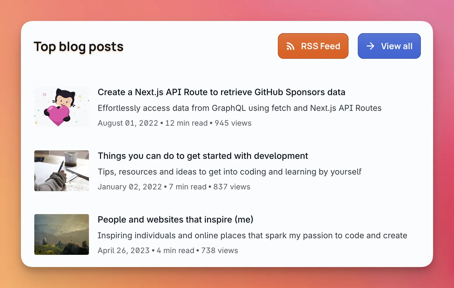
Along with this change, the blog posts list design has been refined to make it a bit more minimal and now you can truly zoom images in blog posts and the uses page. Before, I was doing some tricky style changes to “zoom” them. The new approach is much better.
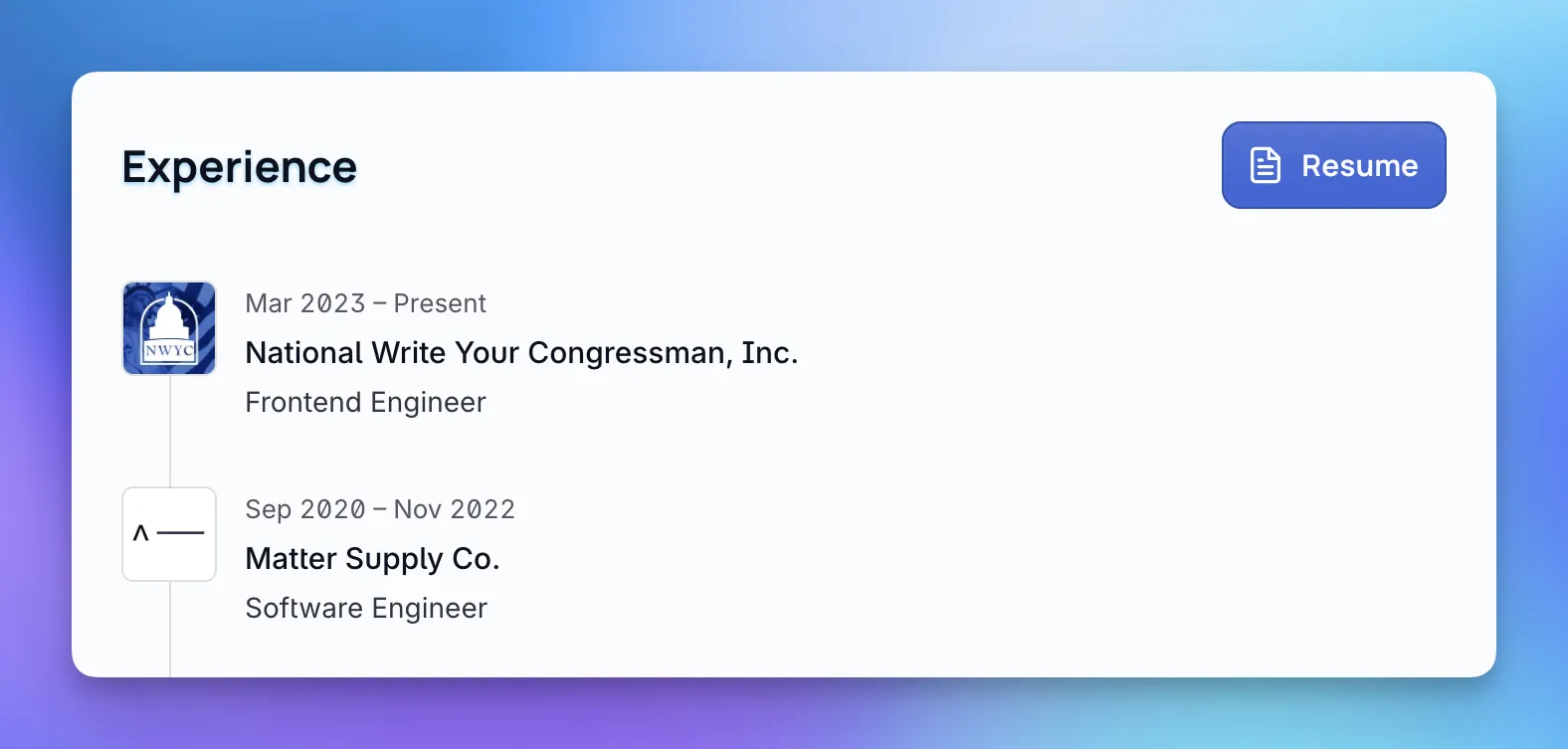
About page
This page has a new section for experience, listing my most recent job positions and including a link to my resume. Additionally, the skills section was moved from the home page to about, including some tweaks in its design.
Additionally, the dashboard has been simplified into just 2 activity items shown there too: music and the book I’m currently reading. I hope the latter makes me more accountable and try to read more books.
📚 Find me on Literal Club and join my reading journey!
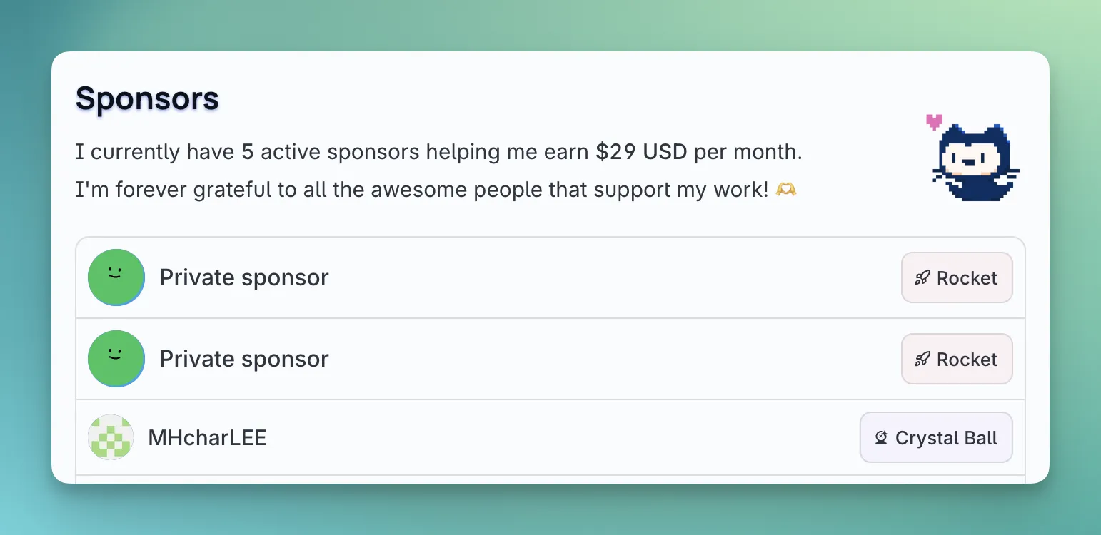
Donate page
This one has been updated for a cleaner look and more concise content. And to improve the transparency there, it also shows private sponsors data now, while respecting their privacy by not showing their names or photos.
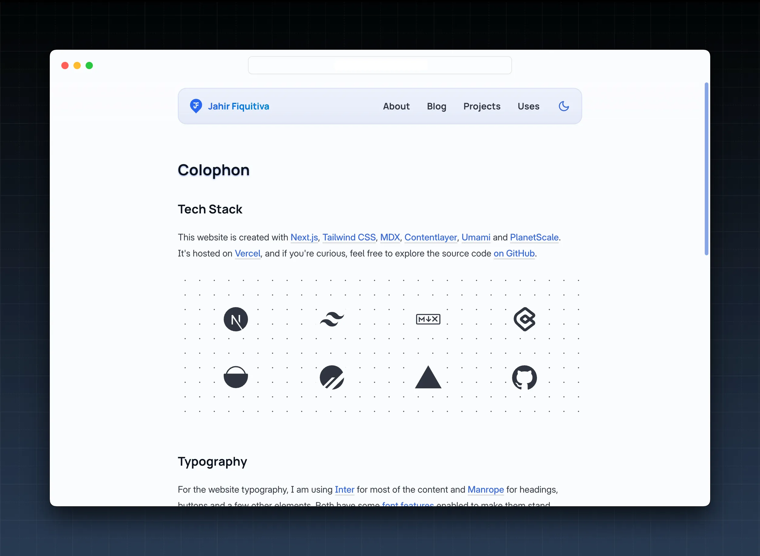
Colophon
I used to have a short section in my uses page mentioning the tech stack used to build this website. This time, I went for a whole page for the colophon, including more details about the design of this website, besides the already mentioned technologies used.
Other updates
There was a lot of changes in the organization and config of the website to make it cleaner and remove a bunch of unused stuff. These changes resulted in a diff of 6162 additions and 6503 removals before writing this blog post.
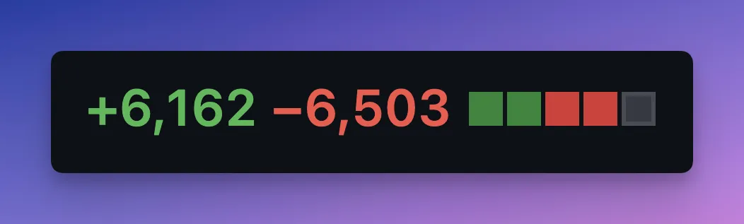
It might not seem like much but the website has new features and pages, and I was yet able to remove a bunch of stuff, plus it really feels better to work on a cleaner workspace.
- Additionally, some previously public API endpoints were moved to server actions as it wasn’t really necessary for them to be available outside the project.
- And some client components where made server components.
- The footer also has a slightly new look, making it easier to navigate all the website pages.
- The uses page received some design tweaks.
Conclusion
There’s still some things that were updated and I didn’t mention here, please let me know if you find them 😉
This website will keep evolving and getting better, but I’m much more happy with it after the latest updates. I really wanted to finish this update as I also would like to work on a couple side projects this year, instead of focusing on my website only.
The design changes have also been inspired by other people’s websites. I will update the inspiration blog post soon mentioning them.
And that’s it, folks! Please let me know your thoughts about the update and share it if you liked it.
Have a great one! 😀