Table of Contents
Intro
It’s been a few months since I gave my website a design update. I’ve been noticing a few things I wanted to change in my site since then and also considering some alternatives to the tech stack I had built my website with.
This time I thought of using Stitches instead of Emotion to create styled components, I already had given it a try a couple months ago, but it had some issues, and I think it was mostly because of how I wanted to build my components and make them extend from one another, which caused a lot of dependency.
That’s also another reason why I decided to build the website from scratch. I think they way I created and organized components before was not the best and caused it to be a bit complex to be updated or maintained.
Same same, but different
Yeah, I didn’t give the website a huge redesign, as there were just few things I thought needed improvement in terms of UI. Instead, I tried to focus on writing less code but making it more useful, less dependent on other components and organizing it a bit better, so that it could be easier to maintain, not just by me, but anyone who would like to contribute to the project, as it’s open-source.
That said, I didn’t reduce the code in a huge amount, according to the pull request, the diff was
+11,615 −12,326 so that’s 711 lines of code less. Anyway, I added more features and content
to different pages that I’ll mention later in this post, so I guess it was a win overall.
Let’s go through the different components and pages updated. I like doing a side by side comparison because it also helps me recognize and be aware of the improvements done. I hope you like them. 😅
Let’s start with the site-wide components:
Content
I’ve reduced the content width to make everything even easier to read and more visually appealing
(in my opinion). I took reference from a few sites I really like, including Lee Rob:
672px wide, Brian Lovin: 655px, Delba: 640px,
then aimed for the average which is 656px, but decided to go with the more interesting value
of 666px 😅😈
Toolbar
Here I decided to not make it wider than the content, plus reducing the padding and spacing between links a bit. Additionally changed the drop shadow for a glow-like one, which you’ll also see in more components.
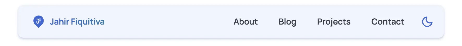

Previous website toolbar design vs New website toolbar design.
Footer
For this component, I decided to reposition the links, add a third column and move the social links to the bottom right. Although it takes a bit more vertical space, I feel it looks more organized and clean now.
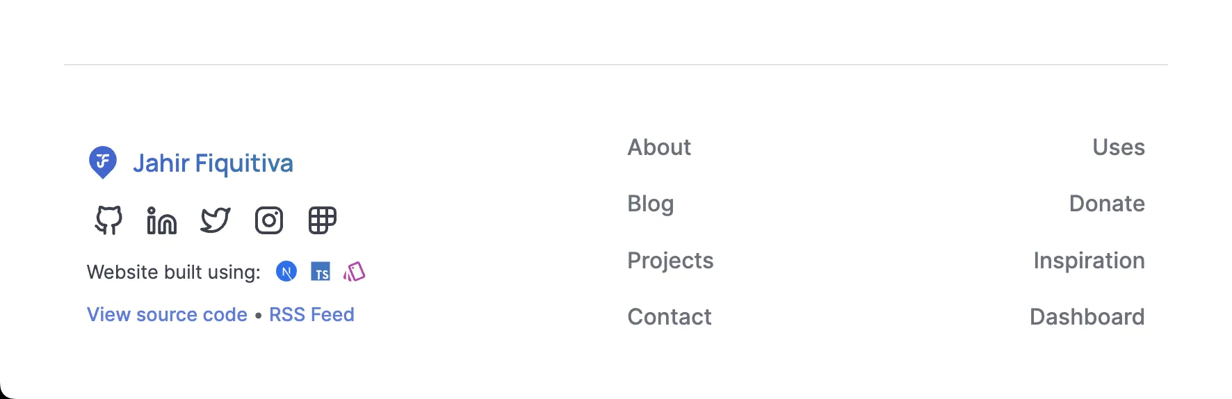
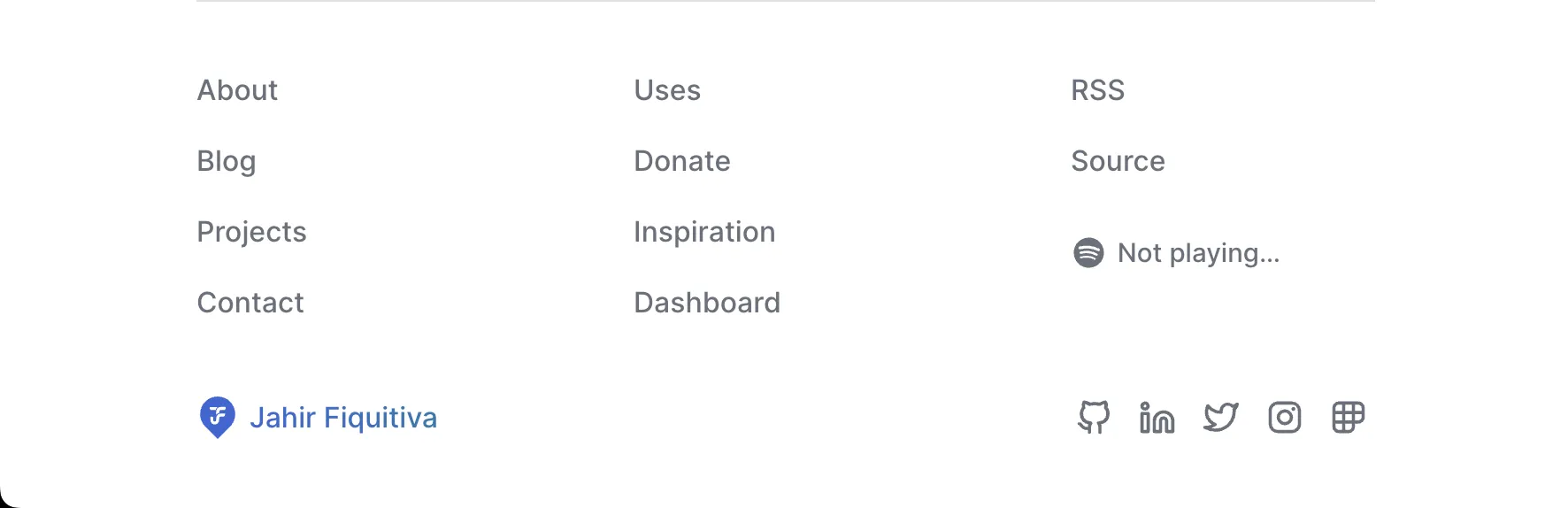
Previous website footer design (above) vs New website footer design (below).
Also, as you can see, I added an item to show the song that I’m currently listening to on Spotify, and it even has a cool animation while the song is playing.
Focusable elements
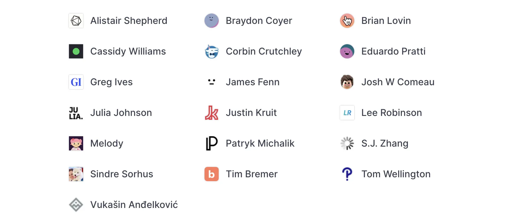
I have added a great looking outline to all focusable elements, which include links, buttons, text inputs and other few. This was based on the styles used by Alistair Shepherd and I think/hope they improve the accessibility of my website.


Pages
Time to go through the different pages:
About
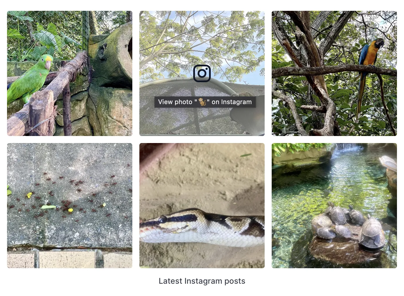
This page was updated to not use so many emojis, make it easier to read. Plus I added a cool feed with the latest 6 photos from my Instagram profile. It’s made using the Behold API; let’s hope it doesn’t pass the rate limit 🤞😅
Blog post
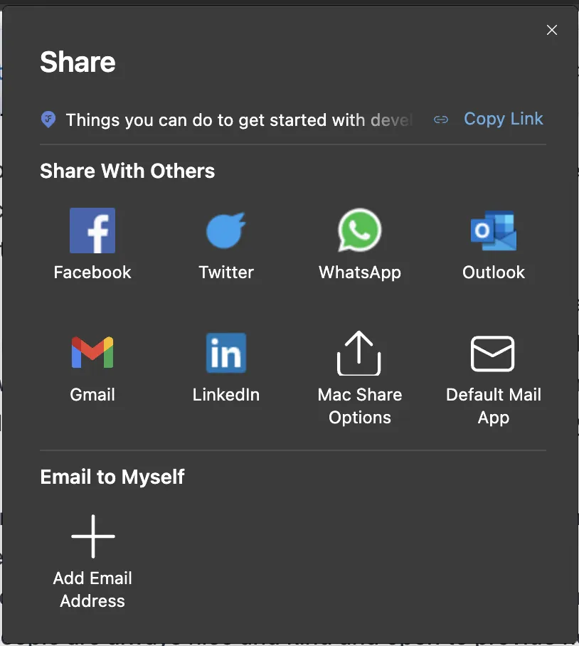
The biggest change here are the share and edit actions. I’ve updated them to look like buttons, plus the share option will use the native Web Share API if it’s available, which brings up more options of sites to share the content, instead of limiting it to just Twitter.


Previous blog post actions (above) vs New blog post actions (below).
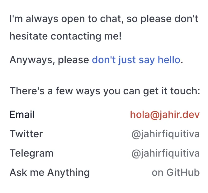
Contact
For this one, I kept it simple and just updated the layout of the different links to kind of look like a table.
Uses
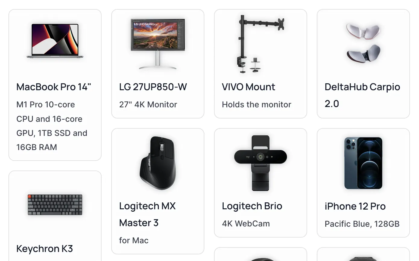
Probably the one that I changed the most, and also one of my favorites. It now includes a photo of my actual in-real-life setup.
Added a grid showing images of the different hardware I use.
Added another grid showing some of my favorite and most used apps on my MacBook
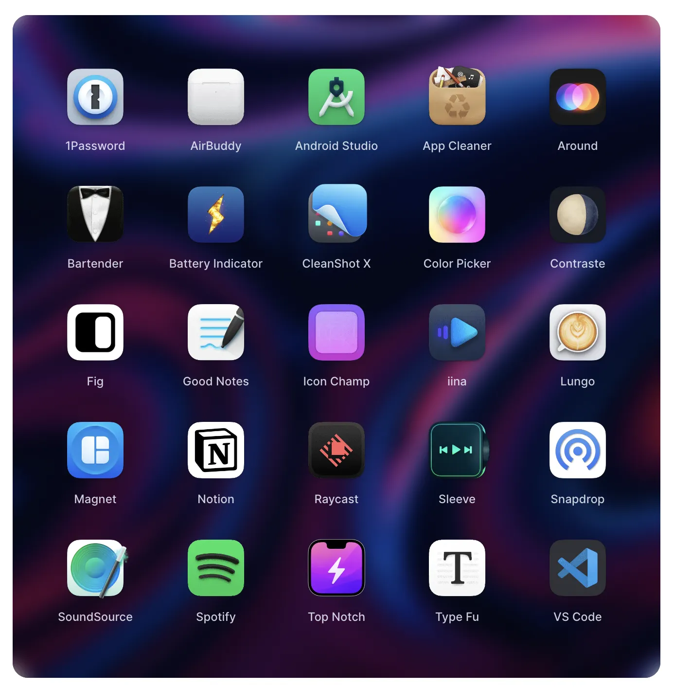
And finally, a cool simple section showcasing the different tools in the stack I used to build this website:
View all these changes at /uses
Donate
This page also changed a lot, I wanted a better way to list my sponsors, plus also add some content aiming to encourage more people to sponsor me.
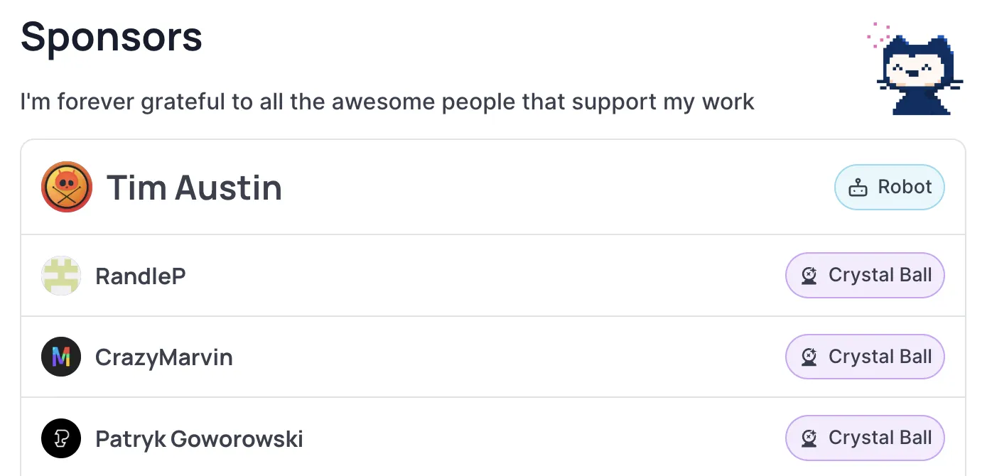
This is part of the new sponsors list or table.
I included some stats for transparency, so everyone can know how many sponsors I have and how much I earn per month from them, and last but not least, some testimonials from previous sponsors.
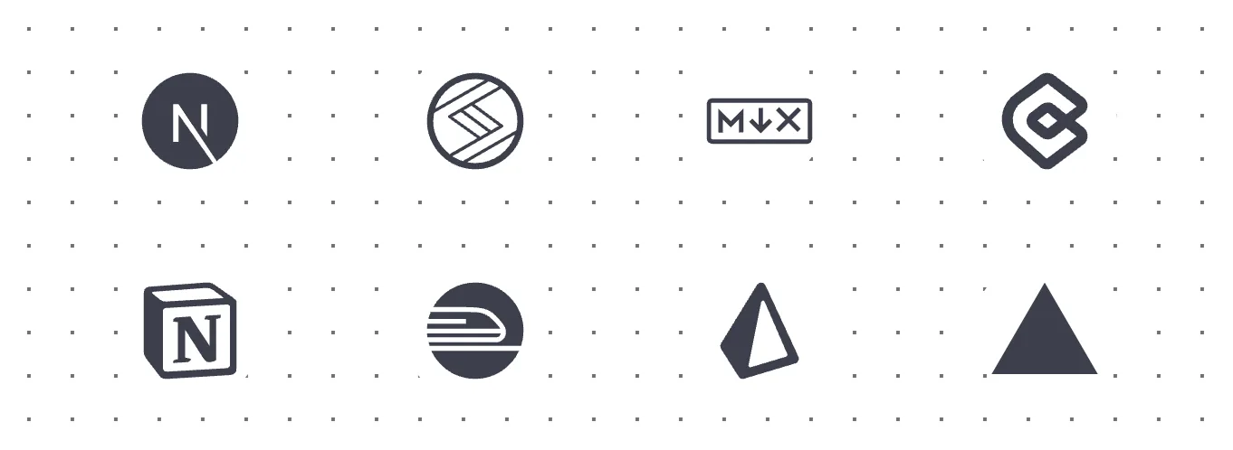
Inspiration
For this page, I decided to go with a simpler design, making items smaller so more content can fit in the same space. And I also fixed some favicons that were not loading, and replaced them with default avatars from Boring Avatars.
Previous inspiration grid (above) vs New inspiration grid (below).
Dashboard
This one also received a big change for the stats specifically. I added colorful icons and cards, and even more stats.
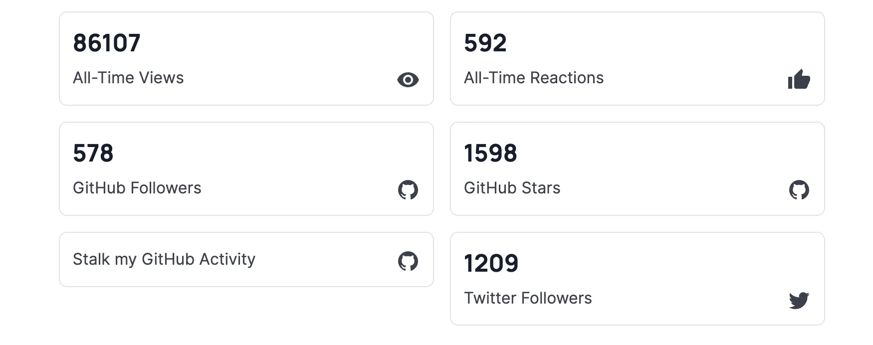
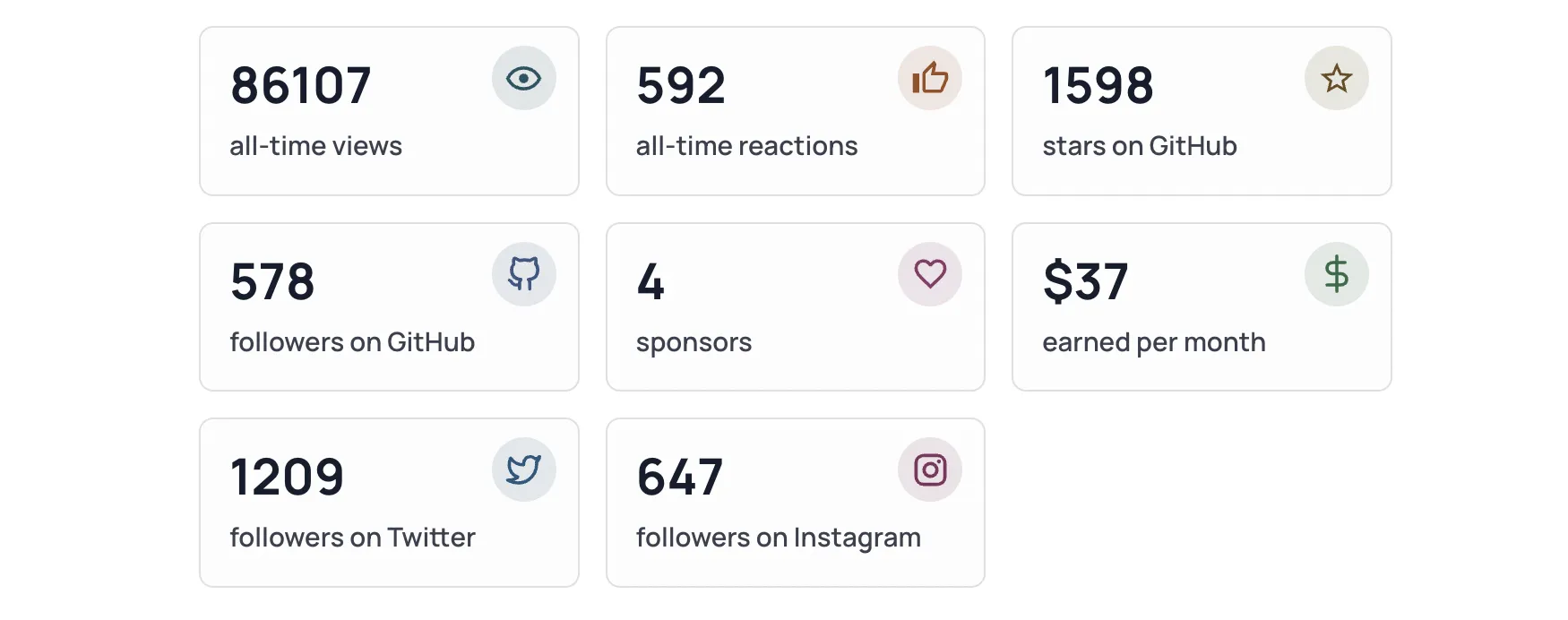
Previous dashboard grid (above) vs New dashboard grid (below).
The rest
The other pages might not have changed much visually, but they do have a few updates in terms of margin, padding, icons, colors and more.
You can view the previous website at v10.jahir.dev and check the differences 😅
Database Updates
Additionally, I moved from PlanetScale to Railway for hosting the database that has the reactions and views records. The reason is I found Railway which supports many different types of projects. I already deployed 5 that are built with NodeJS and Python, and it was a great and pretty straightforward experience.
Those projects were previously deployed to Heroku but they would be “put to sleep” if not used for a while, while in Railway they stay alive, and I’m only charged based on their usage, plus they offer $5 quota for free every month.
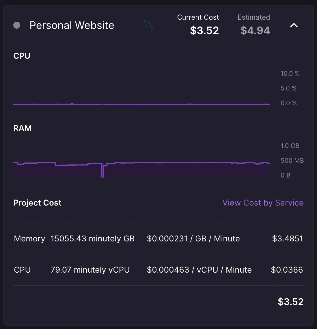
Although the database is the one that costs the most 😬 , the other projects don’t cost more than $0,65 each, but I’m getting closer to the limit… If you’d like to help me out with those costs, you can follow this referral link for Railway, or even sponsor me. Thanks in advance!
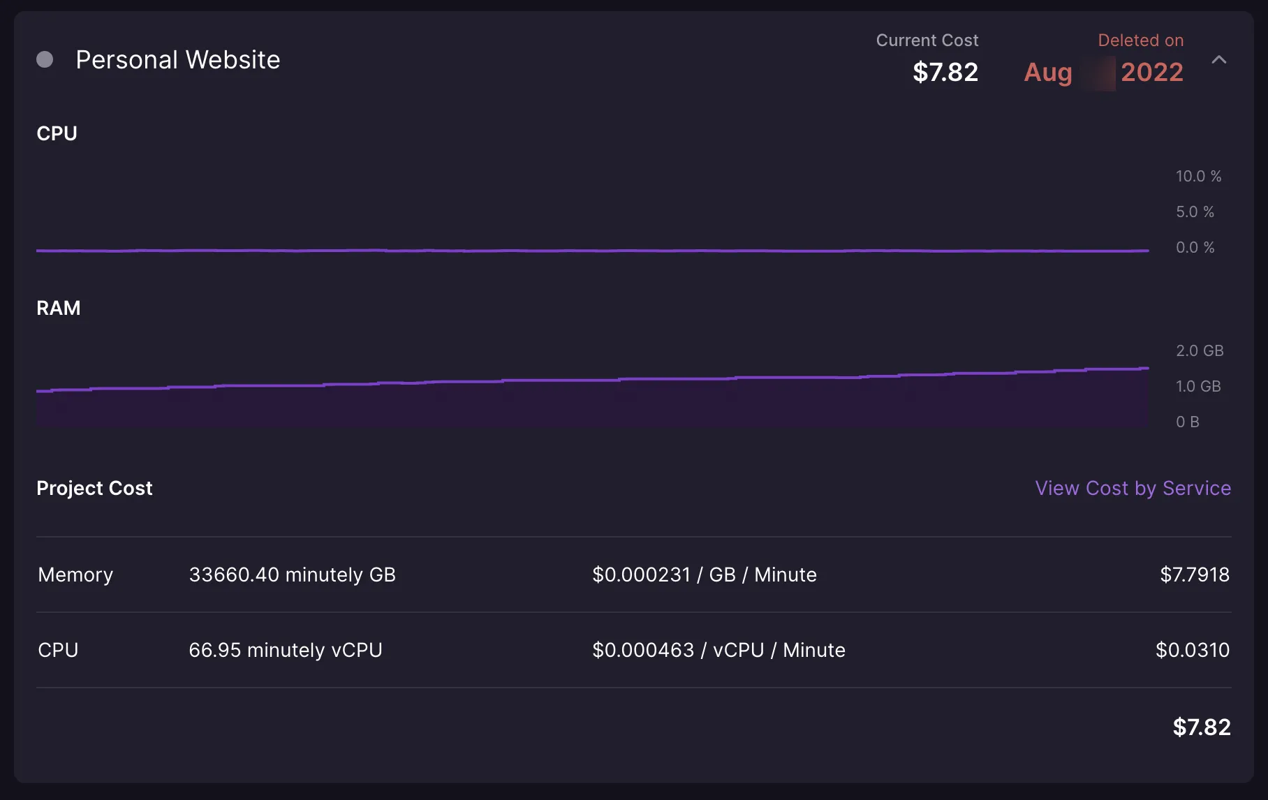
Update: I moved back to PlanetScale.
At least for a MySQL instance, I think Railway is really expensive. My database was just one table with about 12 rows, and the pricing rapidly went from $3.52 to $7.82 in less than 1 month.
I still recommend it for node or python backend projects though, as the pricing is much more reasonable and you might not exceed the free quota so quick.
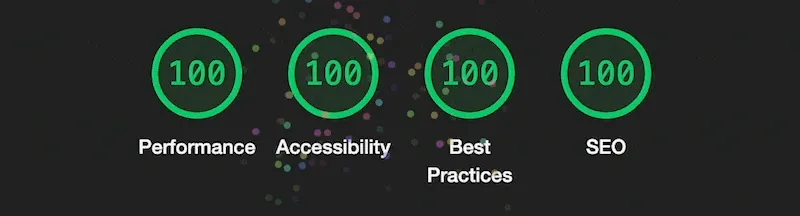
Improved performance
After all these updates, the website has scored 100 points in performance, accessibility, best practices and search engine optimization based on LightHouse tests.
What’s next?
At this time, I don’t really have plans to start from scratch for my website 😅 It definitely takes a lot of time and effort. Anyway, now I’m much more happy with the tech stack, the project structure and the design, so I hope that future updates are much easier to work on.
I hope you enjoyed this post and the different updates; if so, please click on those reaction buttons and share it with your friends! 😁
Special thanks to Patryk Michalik who was really kind and helpful providing feedback and ideas while I worked on this update.