
Table of Contents
Context
iOS 26 was released in September 2025, and with it many things changed, as this new version of the operating system introduced a new design language: Liquid Glass.
It brings a new and fresh look to many apps including Safari, the built-in browser for Apple devices. This one in particular introduced a transparent or semi-transparent toolbar to align with the Liquid Glass design.
Unfortunately, this one can cause certain issues on some websites as the background color of the toolbar is “calculated” by Safari itself.
In previous versions, we were able to use a meta tag in the head of the website’s HTML and it would use that color to tint the toolbar:
<meta name="theme-color" content="#fbfcfe" />But with iOS 26, this no longer works. Not as expected at least.
Why?
Safari 26 scans for
position: fixedorposition: stickyelements near the viewport edges and reads two properties:
background-coloron the element itselfbackdrop-filteron the element itselfIt uses these to compute the tint color for the nearest toolbar (status bar at the top, Safari toolbar at the bottom).
Safari 26 Liquid Glass: toolbar tinting, white bars, viewport bugs - pavel 1ar.ionov 1ar.io Fix iOS 26 Safari Liquid Glass toolbar tinting, viewport-fit=cover gaps, fixed overlay bugs, and fullscreen media bars.
The Issue
This can lead to unexpected behaviors just like the one I had on this very website in a previous version:

As you can see, the toolbar was transparent causing the content behind being visible. In this website, I implemented a particular design with a soft overlay at the bottom, which led to this weird look.
The reason for this is the overlay is near the bottom viewport edge and has a semi-transparent background.
The Solution
The article previously referenced in this post mentioned the posibility of fixing this issue by adding viewport-fit=cover to the viewport meta tag and explicitly setting a background color for the html tag in the CSS styles, but that unfortunately didn’t work.
I was feeling hopeless as it was really hard for me to find a solution, or at least a workaround. After looking through many results in the search engine, I came across with this repository:
This repository’s README confirms the previous information that it uses the colors from fixed elements near the top or bottom viewport edges.
But it provides useful additional information on how Safari’s toolbar tinting works:
Safari will only use an element that is:
- within 4 pixels from the top or 3 pixels from the bottom on iOS;
- at least 80% wide on iOS or 90% wide on macOS; and
- at least 3 pixels high.
It even provides a cool website that you can open in Safari and play around with the color tinting:
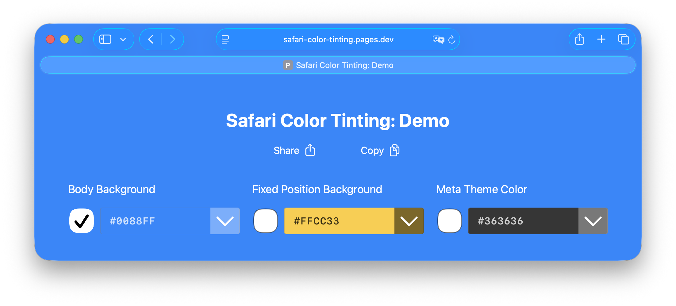
and it led me to the solution:
<div id="fixed-bottom"></div>#fixed-bottom {
position: fixed;
bottom: 3px; /* <4px to supersede <body> on iOS*/
left: 0;
margin: 0;
padding: 0;
width: 90%; /* >88% to superced <body> on iOS*/
min-height: 15px; /* >2px for dynamic color iOS */
z-index: 1000;
background-color: #4285f4; /* Set your custom color */
}Additional Tweaks
This alone fixed the issue for my website, but it was weird to have that bar at the bottom, it just didn’t feel right with the design. So I started tweaking those styles aiming two achieve two things:
- The dimensions and position made it look weird, so it should be as small and as “hidden” as possible.
- The issue was only present on Safari, on iOS devices. Not iPadOs or macOS. So it should only render if that was the case.
To achieve the first, I manually tried different sizes and positions using the Safari Dev Tools and ended up with the following values:
#fixed-bottom {
  position: fixed;
  bottom: -8px;
  left: 0;
  margin: 0;
  padding: 0;
  width: 100%;
  min-height: 12px;
  z-index: 5;
  background-color: #4285f4;
}
The lower this element could live for Safari to use it to tint the toolbar was -8px; the smallest it had to be was 11px tall, but I prefer using even dimensions so I used 12px 😅; and, to make it less weird, I made it 100% wide, which would still comply with the requirement of being at least 80% wide.
Finally, the z-index was not really required but I kept it as 5 to match my website’s navigation bar’s z-index.
Now the trickiest part: showing it only on Safari, and only for iOS devices. Searching through the internet I found a selector to detect if the browser is Safari:
@supports (-webkit-text-size-adjust: none) and (font: -apple-system-body) {
  ...
}
This works for Safari 9 and up, but this was only necessary for Safari 26 and up. Searching more on the internet, I found an issue on the mui project related to the Safari toolbar tinting and found a comment showing a selector for Safari 26 and up:
@supports (-webkit-touch-callout: none) {
  ...
}
To be safe, I combined both 😅 and ended up with the following:
#fixed-bottom {
  ...
  /* Hide by default */
  display: none;
}

@supports (-webkit-text-size-adjust: none) and (font: -apple-system-body) and (-webkit-touch-callout: none) {
  #fixed-bottom {
    /* Show on Safari 26+ */
    display: block;
  }
}
While this worked, for some reason the bar was shown on iPad OS devices too 😬. I unfortunately didn’t find a selector that actually worked on iOS only, but came up with a solution: use a viewport selector to show it on small devices only.
@media (width < 768px) {
  ...
}
And the final CSS looks like this:
#fixed-bottom {
  position: fixed;
  bottom: -8px;
  left: 0;
  margin: 0;
  padding: 0;
  width: 100%;
  min-height: 12px;
  z-index: 5;
  background-color: #4285f4;
  /* Hide by default */
  display: none;
}

@supports (-webkit-text-size-adjust: none) and (font: -apple-system-body) and (-webkit-touch-callout: none) {
  @media (width < 768px) {
    #fixed-bottom {
      /* Show on Safari 26+ AND small viewport width devices */
      display: block;
    }
  }
}
Unexpected Additional Issues
In this website’s blog posts and some of its pages, I have included a special component for “zooming” images, allowing users to view a bigger version of them when they tap or click on an image.
This component uses a position: fixed element which conflicted with the one I added to “fix” the tinting issue, causing the toolbar to be transparent again, but only in those pages that implemented the component.
It was technically always visible but an opacity: 0 set and that was the cause of the issue. As explained by Pavel Larionov’s article the fix was to add display: none to the default styles of that element so that it didn’t exist in the render tree and Safari didn’t sample it.
I’m glad it was actually an easy fix 😅
Conclusion
Be careful of any position: fixed or position: sticky elements you might have near the viewport edges in your website, as they might cause the toolbar in iOS’ Safari 26+ to become transparent or have an unwanted color.
And if you have more than one of those elements, their colors can cause conflicts and Safari might not use the correct one, so double check for those.
The web is always changing and evolving and things like this force us to adapt. Thanks to Pavel Larionov and Andrew Escobar for their blog post and project (respectively) which were an immense help on getting this fixed.
I hope this article sums their guidance up in a way that is easier to understand and/or implement but major props to them.
Til next time ✌️